Homepage widgets

This is a title (required)

-
-
This is a title (required)
-
-
This is a title (required)

Table Header 1 | Table Header 2 | Table Header 3 |
|---|---|---|
Lorem | Ipsum | Lorem |
Ipsum | Lorem | Ipsum |

Lorem ipsum dolor sit amet, consectetur adipiscing elit. Mauris vel sollicitudin ipsum, at auctor leo. Sed dui massa, luctus vel pretium id, sollicitudin eu enim. Vivamus diam nibh, tincidunt quis lorem ut, varius maximus leo. Sed non auctor ipsum. Proin elementum tincidunt pretium. Lorem ipsum dolor sit amet, consectetur adipiscing elit. Ut tincidunt, lorem non pulvinar tristique, turpis magna posuere leo, convallis lobortis neque est quis risus. Donec auctor tristique metus in convallis.
Aenean scelerisque lectus a neque luctus semper. Vestibulum hendrerit neque metus, a gravida enim sagittis sed. Sed quis dapibus mauris. Phasellus interdum ac eros nec convallis. Class aptent taciti sociosqu ad litora torquent per conubia nostra, per inceptos himenaeos. Pellentesque sollicitudin tortor ipsum, at tempus massa varius et. Etiam rutrum mi eget orci consectetur blandit. Maecenas sagittis magna sit amet nulla eleifend, vel vestibulum magna commodo. Maecenas ligula massa, ultricies et mi eu, vestibulum ullamcorper purus. Integer porttitor ac libero quis accumsan. Suspendisse sem lectus, scelerisque sed bibendum vitae, ultricies vel tortor. Aenean eget diam magna. Praesent vestibulum ipsum nisl, ac posuere quam bibendum vitae. Donec eget ullamcorper odio, eu tincidunt orci. Aenean ultricies velit tortor, id blandit enim placerat ac. Pellentesque leo mi, semper a velit efficitur, hendrerit efficitur mi.
Class aptent taciti sociosqu ad litora torquent per conubia nostra, per inceptos himenaeos. Aenean suscipit consequat sem fringilla convallis. Morbi iaculis, ipsum a pharetra vestibulum, mauris nisl molestie enim, sed cursus velit libero vitae diam. In pretium, risus vel suscipit pulvinar, tortor ante suscipit massa, vel pulvinar ipsum lorem vitae mi. Morbi porttitor, urna at sodales sollicitudin, velit tortor faucibus enim, id gravida purus dolor sed massa. Curabitur in blandit quam, ac maximus mauris. Donec ac metus in sapien consequat convallis eget eget erat.
Sed bibendum, nunc a sagittis volutpat, metus mauris sollicitudin sapien, sit amet eleifend lacus urna ornare metus. Maecenas ac convallis ante, vel vulputate purus. Curabitur facilisis ex eu neque condimentum, quis malesuada ex hendrerit. In leo justo, egestas et sollicitudin sed, gravida at turpis. Aenean ac mi ligula. Integer eget nisl sit amet eros condimentum tincidunt. Maecenas mattis imperdiet nisl, id vestibulum justo iaculis a. Nulla ut blandit tellus. Vivamus vel posuere justo. Cras commodo nisi eget vehicula laoreet. In vitae scelerisque neque. In pretium dolor et mauris finibus, ut imperdiet nunc eleifend. Morbi ut ante augue. Suspendisse fringilla mauris magna, eget egestas sem tincidunt in.
-
![Dr. Amanda Cunningham]()
-
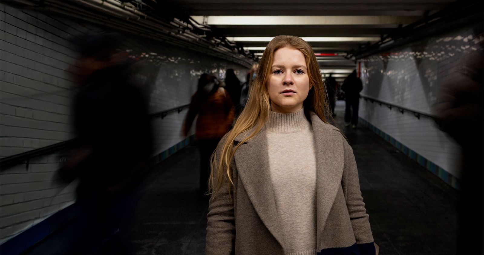
![Woman with a concerned expression standing in a dark corridor]() This is a title (required)
This is a title (required) -
This is a title (required)This is text (optional).
-
This is a title (required)This is a button (optional)

-
This is a title (required)This is a subtitle (optional)This is text (optional).
-
This is a title (required)This is a subtitle (optional)
-
This is a title (required)This is text (optional).
-
This is a title (required)

-
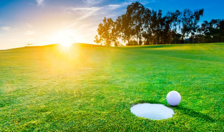
![Annual Kazman Classic Golf Tournament]() Annual Kazman Classic Golf TournamentOntarioIn-personPhysical activities
Annual Kazman Classic Golf TournamentOntarioIn-personPhysical activities -
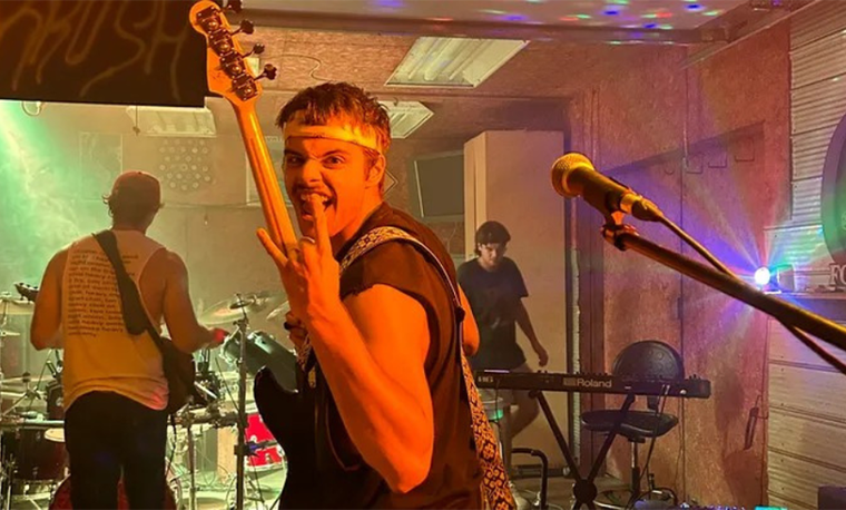
![KRUSH 4 RILEY: A Benefit Concert in Memory of Riley Cerovcec]() KRUSH 4 RILEY: A Benefit Concert in Memory of Riley CerovcecOntarioIn-personOther events
KRUSH 4 RILEY: A Benefit Concert in Memory of Riley CerovcecOntarioIn-personOther events -
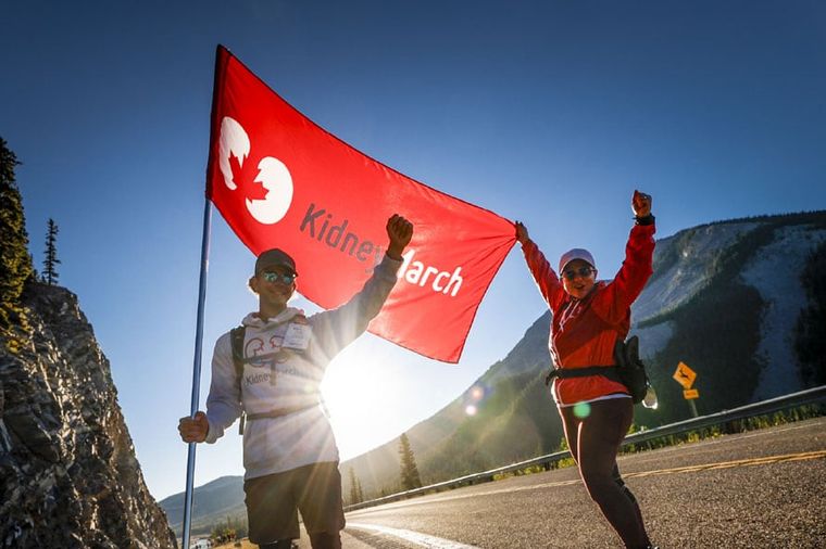
![2026 Kidney March]() 2026 Kidney MarchAlberta SouthKidney MarchIn-person
2026 Kidney MarchAlberta SouthKidney MarchIn-person -
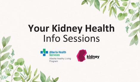
![Your Kidney Health info session (in-person)]() Your Kidney Health info session (in-person)Alberta SouthIn-personWebinars and classes
Your Kidney Health info session (in-person)Alberta SouthIn-personWebinars and classes